PA Media is the UK and Ireland’s national news agency. It is one of the world’s most established and respected news agencies.
PA Media is also the authoritative source of voting results for all kinds of UK elections, from local to national elections. We are joining forces to produce the UK General Election package consisting of plug-and-play election graphics from everviz powered by live voting results from PA Media.
All-in-one solution
The election package is an ‘all-in-one solution’, containing both authoritative election results and engaging, beautiful graphics for all platforms, says Sam Follett, Commercial Director – Media and Sport at PA Media.
“We needed a good way to visualize our election results, to help the public understand how the election is unfolding. We looked at different options, but everviz came out on top.
“They are leaders in providing interactive, accessible, multi-platform data graphics for media.”
Plug and play graphics for TV and online
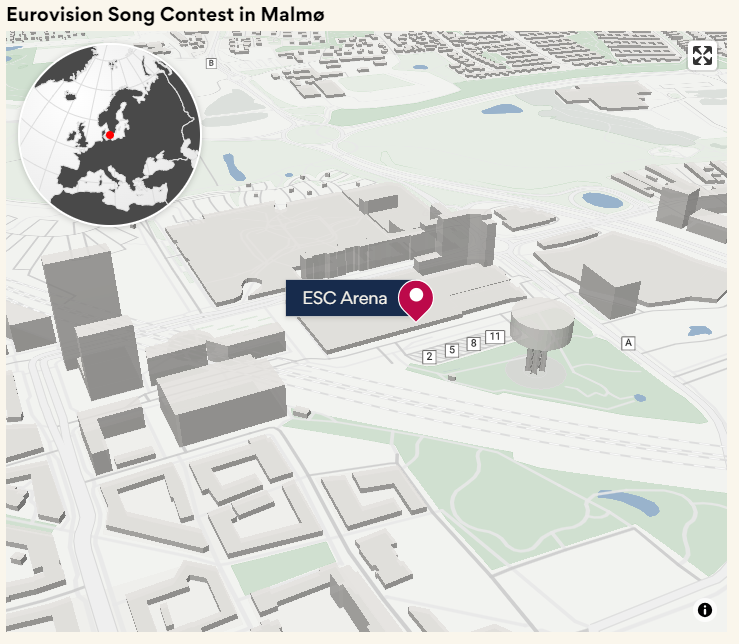
Media outlets simply paste chart embed codes on their website, in their playout engines, or download video versions to add to video packages.
Charts and maps auto update, feeding viewers with the latest results. Chart design and data configuration is handled by the everviz team, along with any branding or customizations.
Engaging election results on all platforms
This partnership means media outlets can more easily inform their audiences about elections, everviz CEO Håvard Tveit says.
“PA Media has always maintained a rich and trustworthy database of election results,” Tveit says. “At everviz we have years’ long experience in data visualization. Early on, we all saw value in our organizations joining forces to make a package to help the media cover elections in a good, engaging and beautiful way.”
Charts and maps on websites are interactive and accessible. TV presenters can interact with the charts on a touchscreen in the studio.
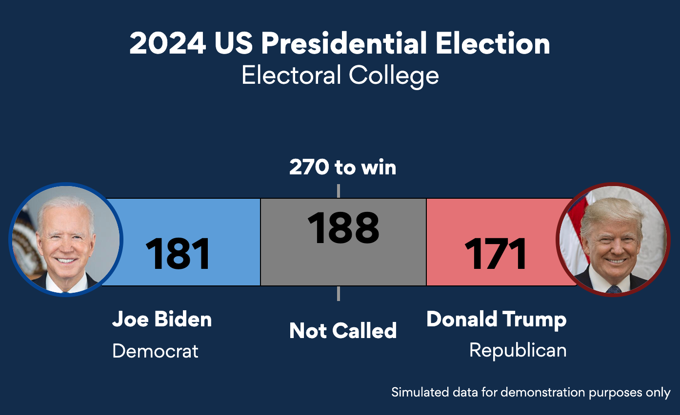
This partnership announcement follows the release of the US election package, where charts and maps are fed with election data from the Associated Press.


